Care AI Studio
Customer support, Enterprise AI
Time & Place is a dating app designed to move online matches toward real dates. As Founding Designer and Advisor, I reset the product direction, redesigned the core iOS experience, built the design system and shaped a venue-partnership model.
Case study by Mike Iukhtenko
When I joined, the first release asked people to plan a date before they had enough confidence in the match. I reframed the product around a simple principle: every feature should either build trust or help two people meet. This connected onboarding, discovery and date planning into one experience.

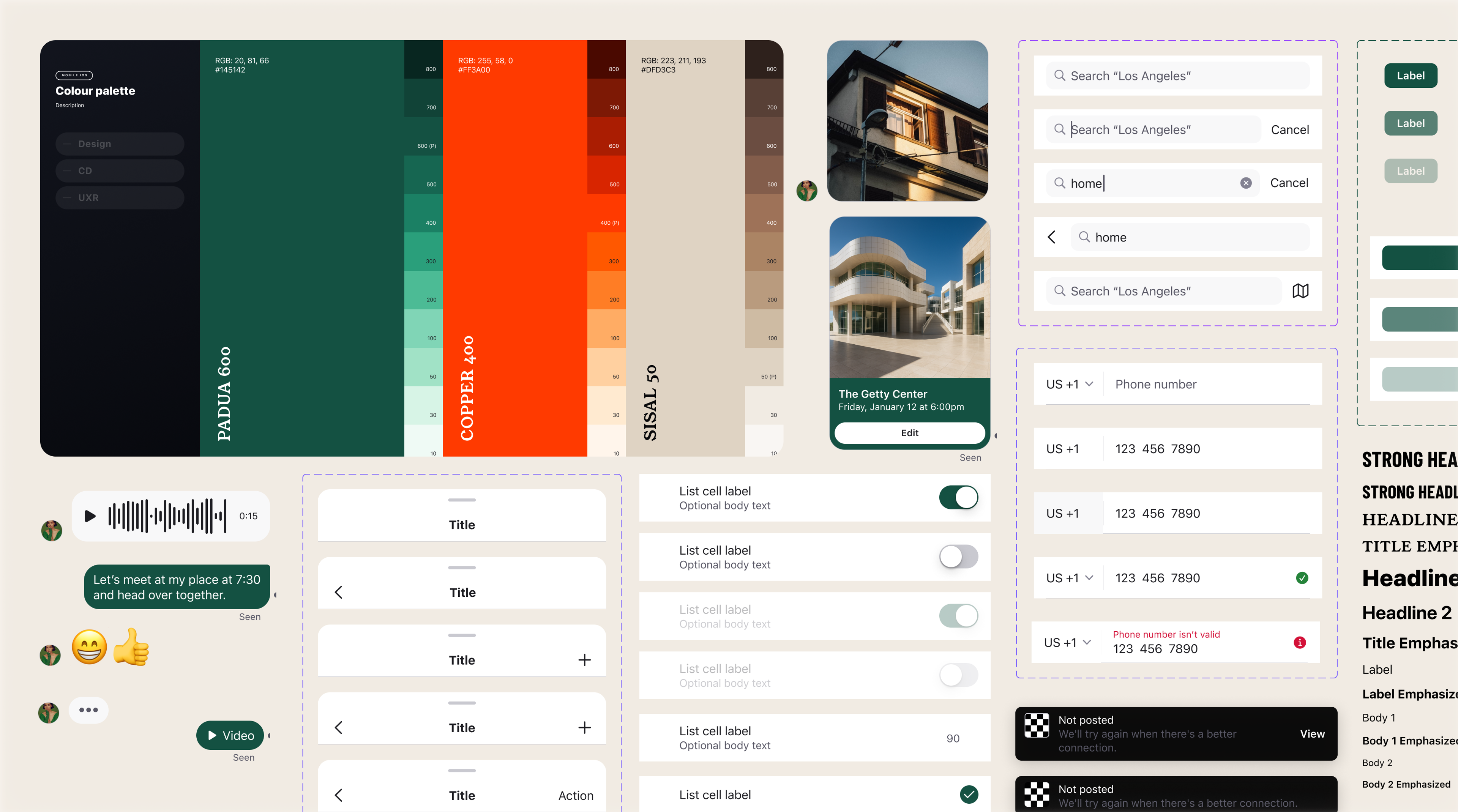
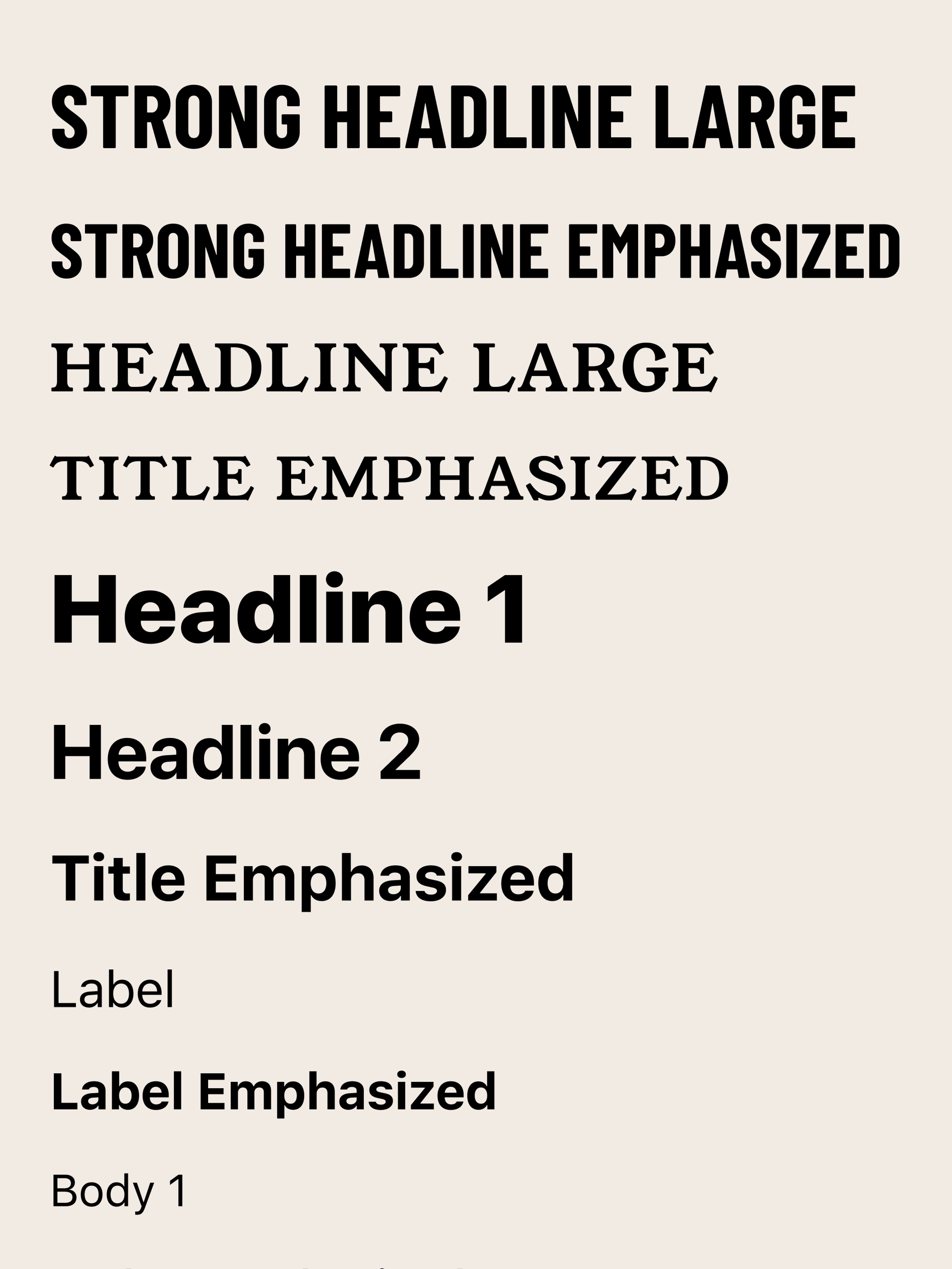
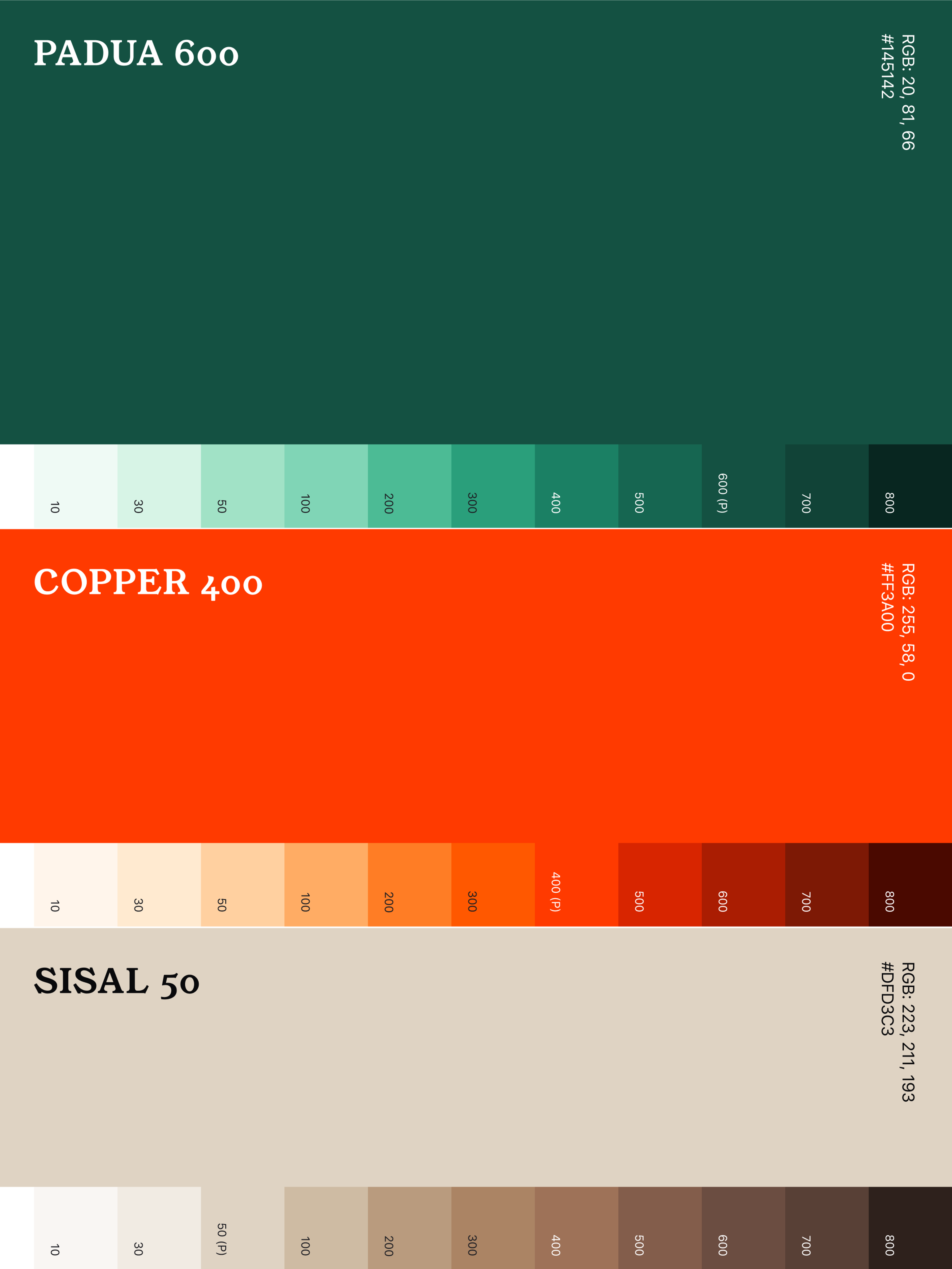
The existing interface was assembled from one-off screens. I introduced reusable components, tokens and variables so design and engineering could work from the same system. When the brand changed in 2024, the new visual language was applied across the app in days.
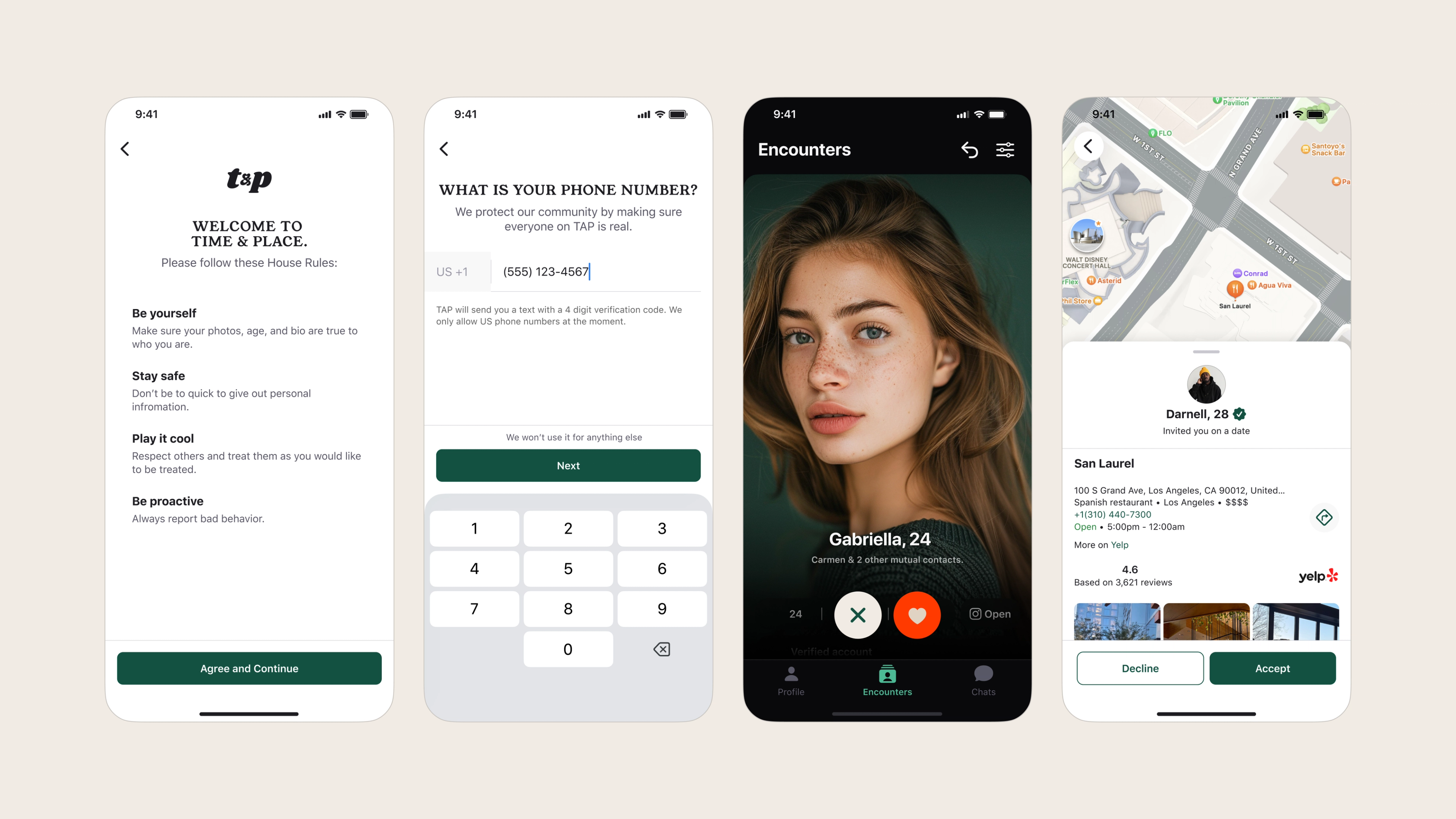
Onboarding introduced community rules, phone verification and personal preferences in a paced flow. The aim was to establish safety and intent before asking someone to move from a profile to an in-person date.
After a match, either person could propose a venue, date and time inside the app. Both people could review the location, accept or decline, and keep the plan attached to the conversation. This replaced open-ended coordination with a clear next step.
The revised product increased signups and led to more dates being created. The venue recommendation model also gave the startup a partnership-based alternative to subscriptions, linking commercial value to real-world dates.